Have you ever heard of describing a person by their favourite colour? So, what’s your favourite colour? Not only the personality, but a lot of things about your website also can be said by colour. Not many entrepreneurs know this. If they knew colours have this much of an impact on the mood of visitors, they would have thought twice before choosing the colour for their online store. Getting the right combination of colours can decide whether the visitor is going to buy, return or just looking. This is how much important the colour psychology is.
According to a study conducted by Seoul Colour Expo, nearly 92% of consumers have agreed that the colour has an impact when deciding to buy or not. Another research done by the Institute for Colour Research has revealed that people tend to judge things based on the colour within the first two minutes of the initial viewing.
BROWN

Brown colour gives you a feeling of reassurance and confidence. It has a strong and dependable aura which can motivate the visitors and convert a prospect. This colour will go well with chocolate, confectionery as well as leather crafts.
ORANGE
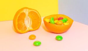
With energetic, ambitious aura, Orange represents passion, freshness and originality. This will give your visitors and customers a positive and exciting vibe. For Candy shops, toys, electrical or electronic items, this would be a good choice.
YELLOW

Yellow can easily captivate eyes and highlight your products. It radiates cheerfulness and playfulness. But the excessive use can cause for losing customers as it can be a little disturbing. If you provide services related to construction, creative designing, yellow is worthy to try.
GREEN

Green is the representation of nature and freshness. For organic products, this is the colour you must use. It is said that the green colour is easy on the eyes. So, it relaxes your mind and makes you feel safe, positive and fresh. Beside organic products, gardening tools and equipment, medicinal products also match well well with green.
PINK
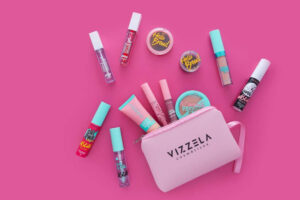
When you hear pink, you naturally think of kids or girls. Even though it is a colour associated with femininity, it also gives off the feeling of affection. It has this soothing effect that can be used with an aggressive colour like black to make an unexpected atmosphere. Pink can be used for cosmetics, kids items, little ornaments, cake or sweet shops.
RED

If it is red, it means something special. Like Christmas! Red touches someone’s deepest emotions. It is associated with life, confidence and love. If used wisely, you can captivate more people. Do not overuse or, people will feel creepy.
If you are thinking of launching a holiday campaign, this is it. For beverage, cakes, decors, chocolate or wine stores, red would be a good companion.
WHITE
According to colour psychology, white is the colour of purity, clarity and wholesomeness. Using white colour around your content makes you feel free like you are in a boundless space. Not the feeling of being in a box. It exudes a healing aura which makes you feel good and calm. At the same time, it gives off a sense of elegance and perfection which will match well with crafts, interior.
PURPLE
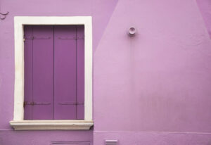
People call this the royal colour. Well, it’s not an overstatement as the purple colour is it is associated with the British Royal Family. Purple colour radiates power and affluence. This colour is often used for fashion& accessories web sites.
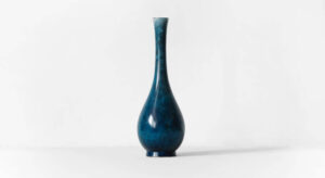
BLUE
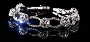
Blue is one of the most used colours for websites. It conveys the feeling of loyalty, peace, productivity and luxury. You can add a sense of elegance, cleanliness or nobility to your website through a proper dosage of blue colour. When used for a jewellery store, you can give off a sophisticated look. But there are times you need to avoid this colour. If you provide hospitality service, especially for eateries you can’t use the colour blue. It is said that it decreases appetite.
(But, you can see some world-famous food-related brands use blue colour. Afterall, colour psychology can vary from person to person as well as from brand to brand!)
GREY
Grey is usually connected with seriousness and conservative mind making it common for corporate related websites to use the colour. Other than that, interior, crafts, accessories or jewellery stores also use this colour for their websites. Being in between black and white, it carries both of their qualities to a minor extent. So, when used along with colours like Royal blue, orange or red, you can showcase completely different atmospheres.
BLACK

Black is the colour of strength, dominance, power. But at the same time, it gives off dark, lonely feelings too. So, knowing when to use the colour black is important. Mostly used for high-end products.
So, the conclusion is that the colour is a crucial fact in E-commerce. They can manipulate a visitor in both good or bad way. that means if you are using the wrong colour mix, they might just look for another store. So, you need to understand your products well and what colours go with them well. Colours can have different effects on males and females as well as their age. So, your target customers also need to be considered when selecting the colours. Now let’s take a look at how this colour psychology works.


Recent Comments